From Friction to Flow
How I Simplified Referrals to Boost User Engagement and Increase Completion Rates by 15%
Role & Responsibility
Design Lead, UX Researcher, Interaction Design, Prototyping
Industry
Fintech, HR
Year
2024
outcome
Context
Salary Hero is a financial service that allows employees to access their salary in advance. The application is integrated through HR systems of companies such as Red Bull, Starbucks, KFC, Ford and Hertz.
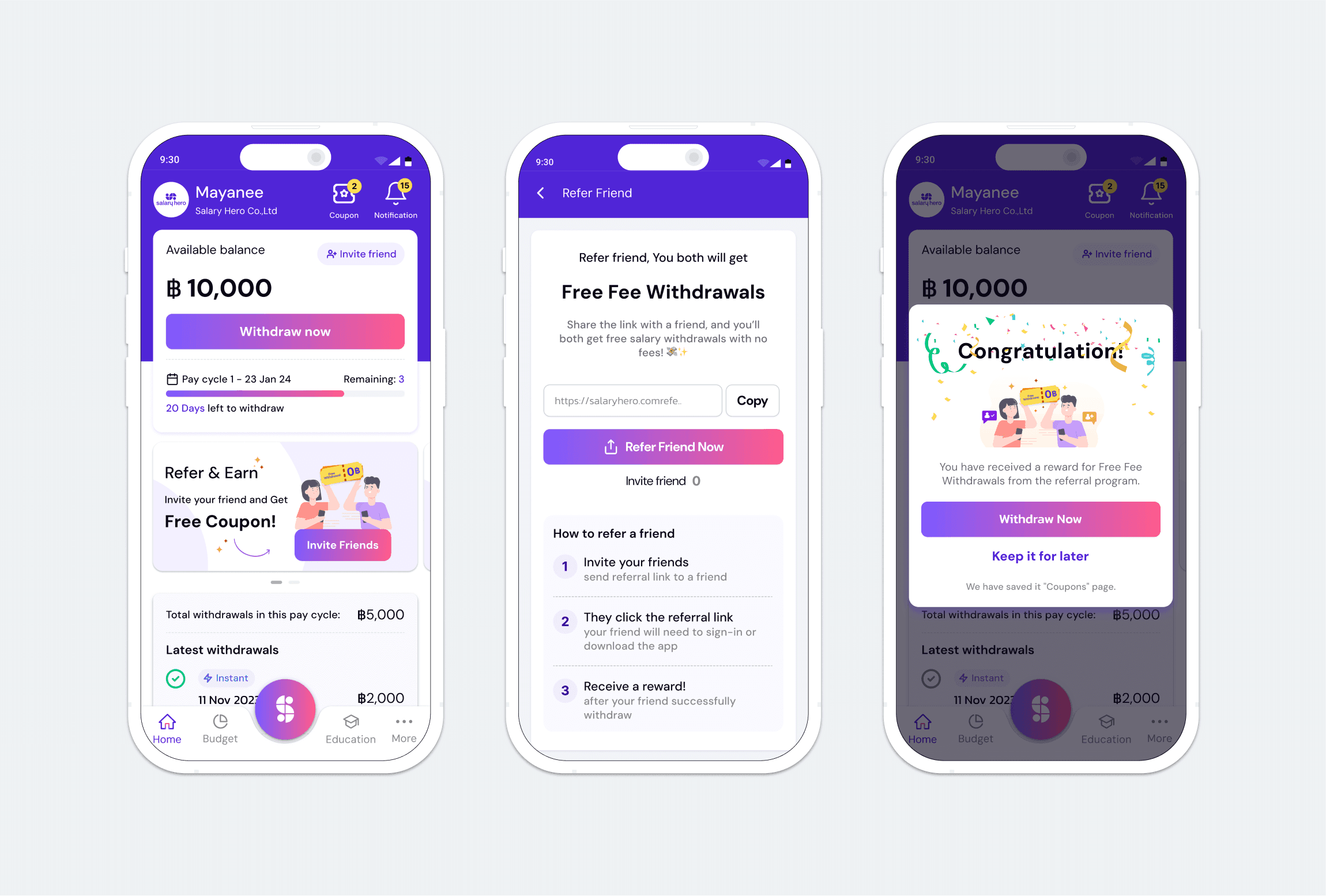
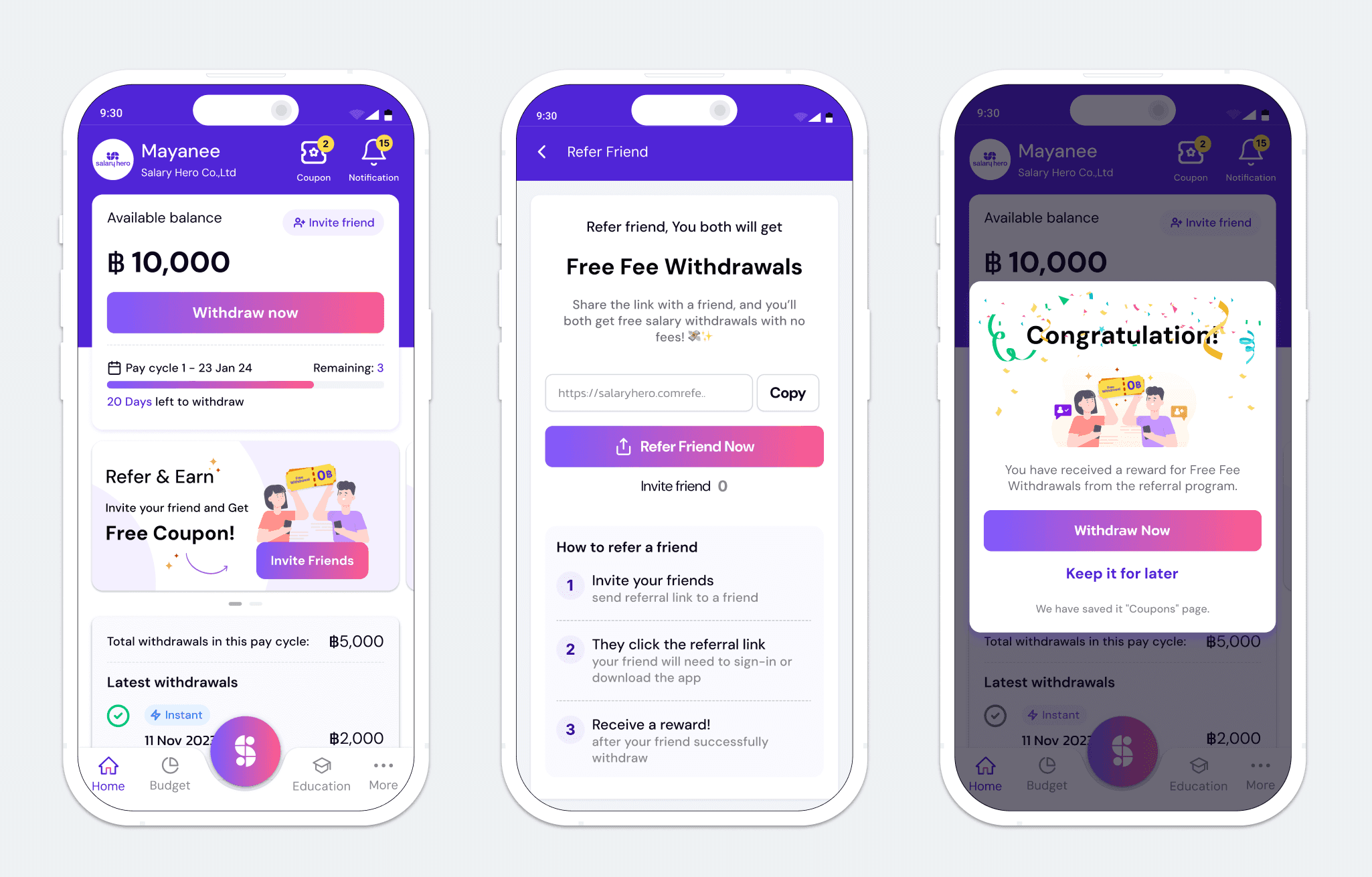
The referral program is a core feature within the app, designed to allow users to share referral codes with colleagues. Initially launched with an MVP focusing on simple processes, there was still significant room for improvement to maximize the feature's potential and improve user experience.
Challenge:
How might we create a referral program that is easy for referrers to send codes and for referees to receive and use them?
Solution
To ensure focus and clear success criteria, I divided the project into two key milestones:
M1: Simplify the send and receive code journey.
M2: Improve the process for applying the referral code.
Discovery
Data Analytics
Working closely with the PM, I analyzed data that tracked the journey from when users entered the app to when they copied the referral code.
Data showed that 95.1% abandon rate from the homepage, 56.1% abandon rate from the referral buttons in other areas. and 2.1% of users copied the code.
The current tracking setup lacks visibility into the completion rate after the referral code is copied. To fully evaluate the performance of the referral feature, we need to implement tracking across the entire journey—starting from copying the code to sending it, applying the code, and receiving the incentive.
Usability Testing
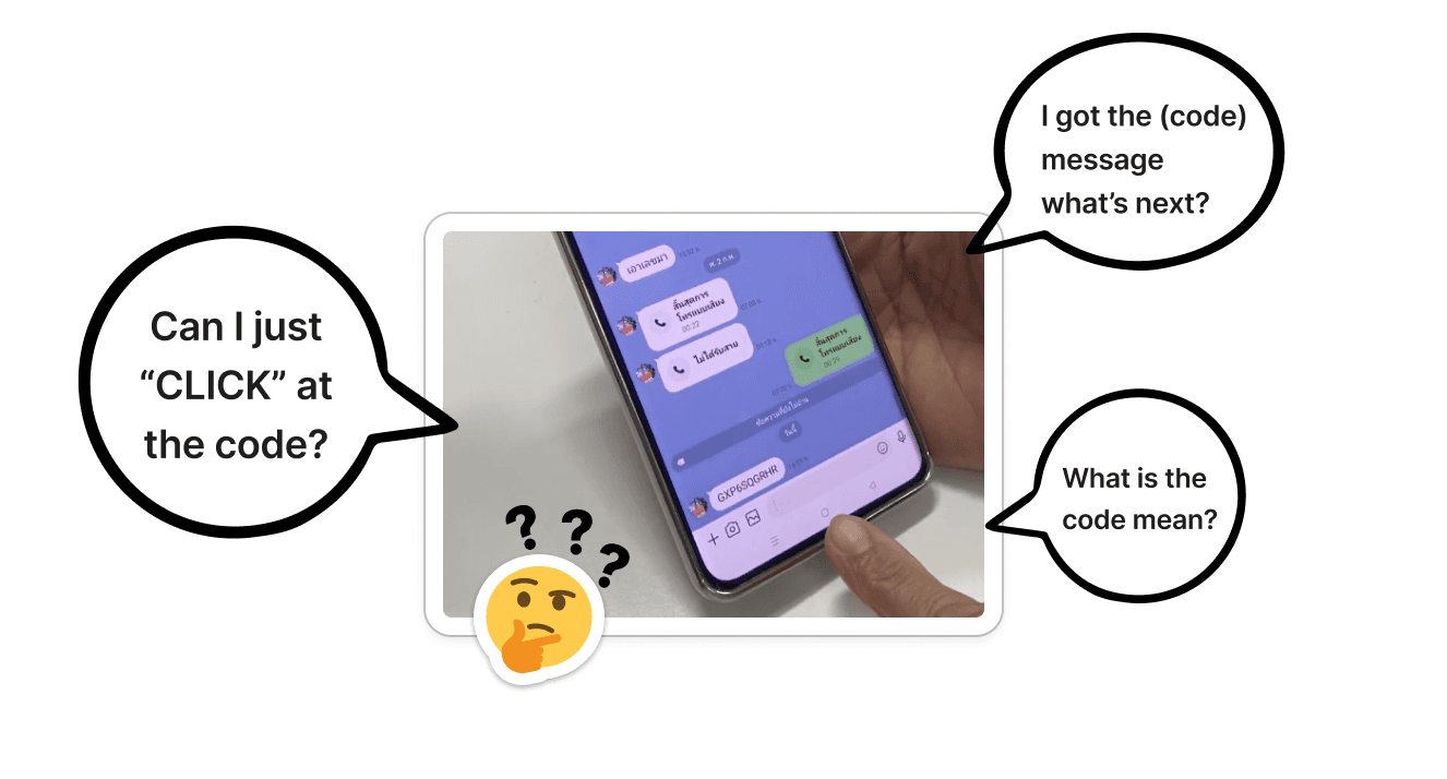
We conducted usability testing with six blue-collar workers—three referrers and three referees. The goal was to understand how users interacted with the referral process.
Observation
Half of the participants didn’t understand how to send or apply the referral code.
Referees were unsure how to use the code after receiving it via messaging apps.
Participants found the copy-paste process confusing and unclear.
Key Finding
Low-tech-savvy users struggled with basic tasks such as copying and pasting codes.
Unclear instructions led to confusion, causing users to rely on others for help.
Recommendation
Explore alternative mechanics, like using UTM links instead of requiring users to copy and paste codes.
Improve the information architecture of the referral page, providing clearer instructions.
Refine the copywriting for clarity and simplicity.
Ideate and Iterate
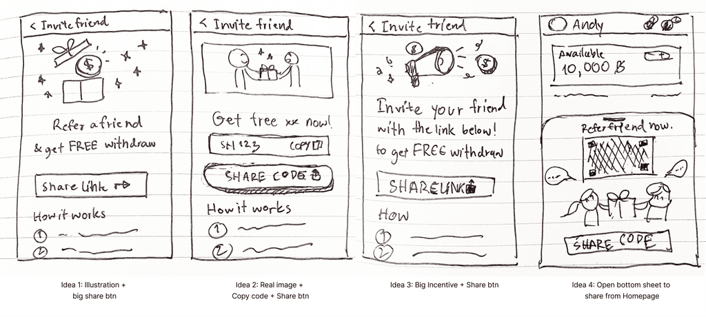
I sketched out ideas that reorganized the information architecture to enhance user understanding, focusing on content hierarchy and simplified instructions.
Sketching idea of referral program page
Designs + Prototypes
After solidifying the interaction model and design direction, I polished the designs and created a prototype.
Results
The redesign focused on improving the information architecture while retaining the copy code feature. Key results included:
Successful Launch: The updated referral program was launched to both new and existing users.
30% Decrease in Time Spent on the Referral Page: The improved layout reduced the time users spent figuring out how to use the feature.
15% Increase completion rate: Organizing content more clearly helped users complete the referral task faster, increasing efficiency.
Next Step
I initially designed the complete flow—from sending the referral code to applying it. However, with limited resources, we prioritized developing the “send code” flow first. The remaining steps, including code application, are planned for upcoming sprints. This phased approach allows us to make impactful improvements while staying agile.
Key Takeaways
The key takeaway from this project is a reminder that you are not your user. We often assume users will easily understand what we design, but that's rarely the case. Talk to your users and observe how they interact with the product—this insight is invaluable.
Additional Key Takeaway: Some projects, like this referral program, require breaking development into multiple sprints. Designing the entire end-to-end flow upfront is essential to ensure a holistic user experience and clearly define success metrics. This approach helps align each phase with the bigger picture, allowing for smoother, more strategic implementation.


